
Square Inch
Brand Identity & Design System
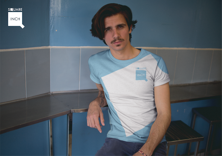
The Brief
Create a bold, flexible identity for Square Inch that reflects precision, structure, and a modular way of thinking.
The Approach
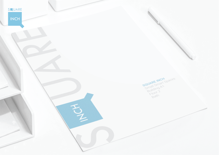
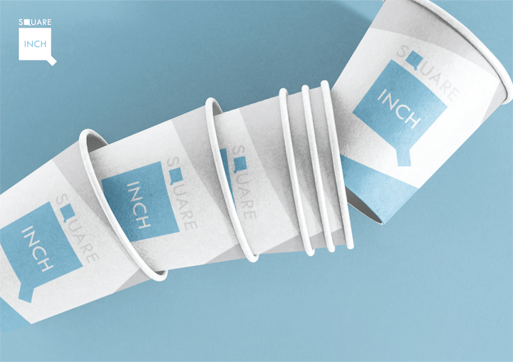
The focus was on building a clean, geometric identity system rooted in measurement and form. Simple shapes and consistent spacing create a visual language that scales across different formats.
Rather than relying on decoration, the design leans on structure. Layout, proportion, and repetition do the work, allowing the brand to feel controlled without becoming rigid.
The Outcome
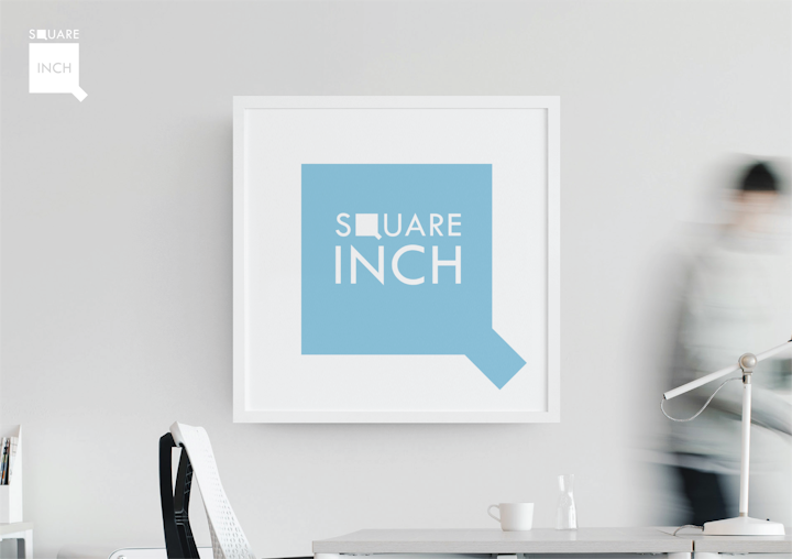
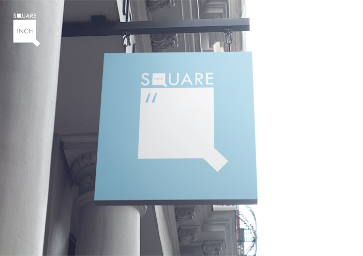
A clear, adaptable identity that works across print and digital. The system holds together through consistency, while still allowing variation in layout and application.
The result is a brand that feels precise, confident, and easy to apply without losing clarity.