


Rydm
Brand Identity & Digital
The Brief
Rydm needed a modern identity for their music app, built around a distinctive logo that could stand on its own without relying on the name. It had to feel current, flexible, and work across both digital and physical applications.
The Approach
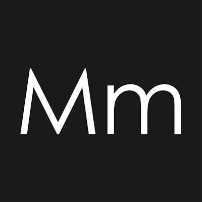
The identity was built around a custom letterform, using negative space to create a mark that feels structured but fluid. The focus was on rhythm and movement, without leaning into obvious music clichés.
A minimal palette and bold shapes keep the system clean while still carrying personality. The design was developed to scale across different formats, from interface to print and merchandise, without losing clarity.
The Outcome
A confident, recognisable identity that works just as well in isolation as it does within a wider system. The brand holds its own across digital platforms and culture-led applications, creating something that feels considered, modern, and built to last.